YepCode Forms Customization
Default Behavior
Section titled “Default Behavior”When you set only the team and processId, YepCode Forms exhibit the following default behavior:
- The form initiates the process execution.
- A loading overlay is displayed during execution with the message: “Sending information…”
- Upon success:
- The response object is logged in the JavaScript console.
- The form element is replaced by the message: “The form has been successfully submitted.”
- Upon error:
- The response object is logged in the JavaScript error console.
- The form element is replaced by the message: “There has been an error submitting the form.”
These behaviors can be extended with the following configurations:
Add Success or Error Callback Functions
Section titled “Add Success or Error Callback Functions”You can provide functions to manage the process execution response. This is powerful, allowing actions like retrieving records from a database and showing them to the user.
The syntax for setting these functions in each approach would be:
<div data-yepcode-form-team="<yepcode-team-id>" data-yepcode-form-process="<yepcode-process-id>" data-yepcode-form-on-success="(optional) HANDLER_FUNCTION_NAME" data-yepcode-form-on-error="(optional) HANDLER_FUNCTION_NAME"></div>Provide a globally available JavaScript function (called with window.${functionName}), that receives the generated formId, and the JSON result of the started execution. For example:
<script> window.manageOutput = (formId, jsonResponse) => { document.getElementById("output").innerHTML = JSON.stringify( jsonResponse, 2, null ); };</script>The same approach works for success and error callbacks.
Simplified syntax to directly provide functions:
<div id="my-yepcode-form"></div><script> YepCode.initForm("#my-yepcode-form", { team: "<yepcode-team-id>", process: "<yepcode-process-id>", onSuccess: (formId, processExecutionResult, formSubmittedData) => { console.log(`Form ${formId} has been successfully submitted.`); console.log(`Sent form data was:`, formSubmittedData); console.log(`Received response was:`, processExecutionResult); }, onError: (formId, error, formSubmittedData) => { console.error(`Form ${formId} submission failed`); console.error(`Sent form data was:`, formSubmittedData); console.error(`Received error was:`, error); }, });</script>Similar syntax to the JavaScript function:
import YepCodeForm from "@yepcode/react-forms";
const MyComponent = () => {  return (    <YepCodeForm      team={"<yepcode-team-id>"}      processId={"<yepcode-process-id>"}      onSuccess={(formId, processExecutionResult, formSubmittedData) => {        console.log(`Form ${formId} has been successfully submitted.`);        console.log(`Sent form data was:`, formSubmittedData);        console.log(`Received response was:`, processExecutionResult);      }}      onError={console.error}    />  );};
Default Behaviors Using Response Information
Section titled “Default Behaviors Using Response Information”We have implemented several default behaviours to handle the most common use cases:
Show a Success Message from Process Execution
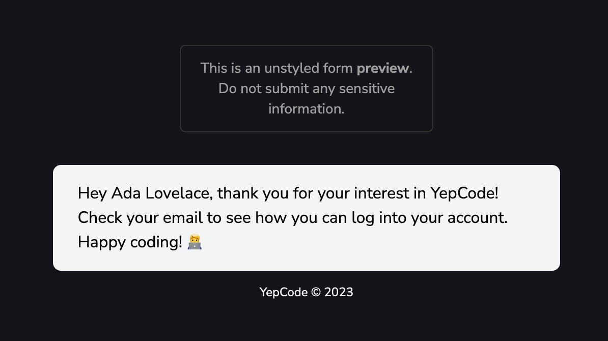
Section titled “Show a Success Message from Process Execution”If your process execution returns a JSON containing a message attribute (that could include HTML code), …
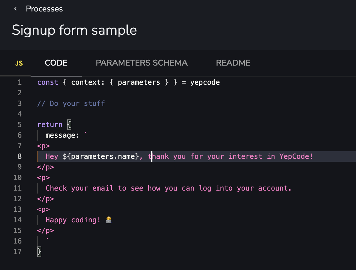
… it will be used if form submission was successfull:
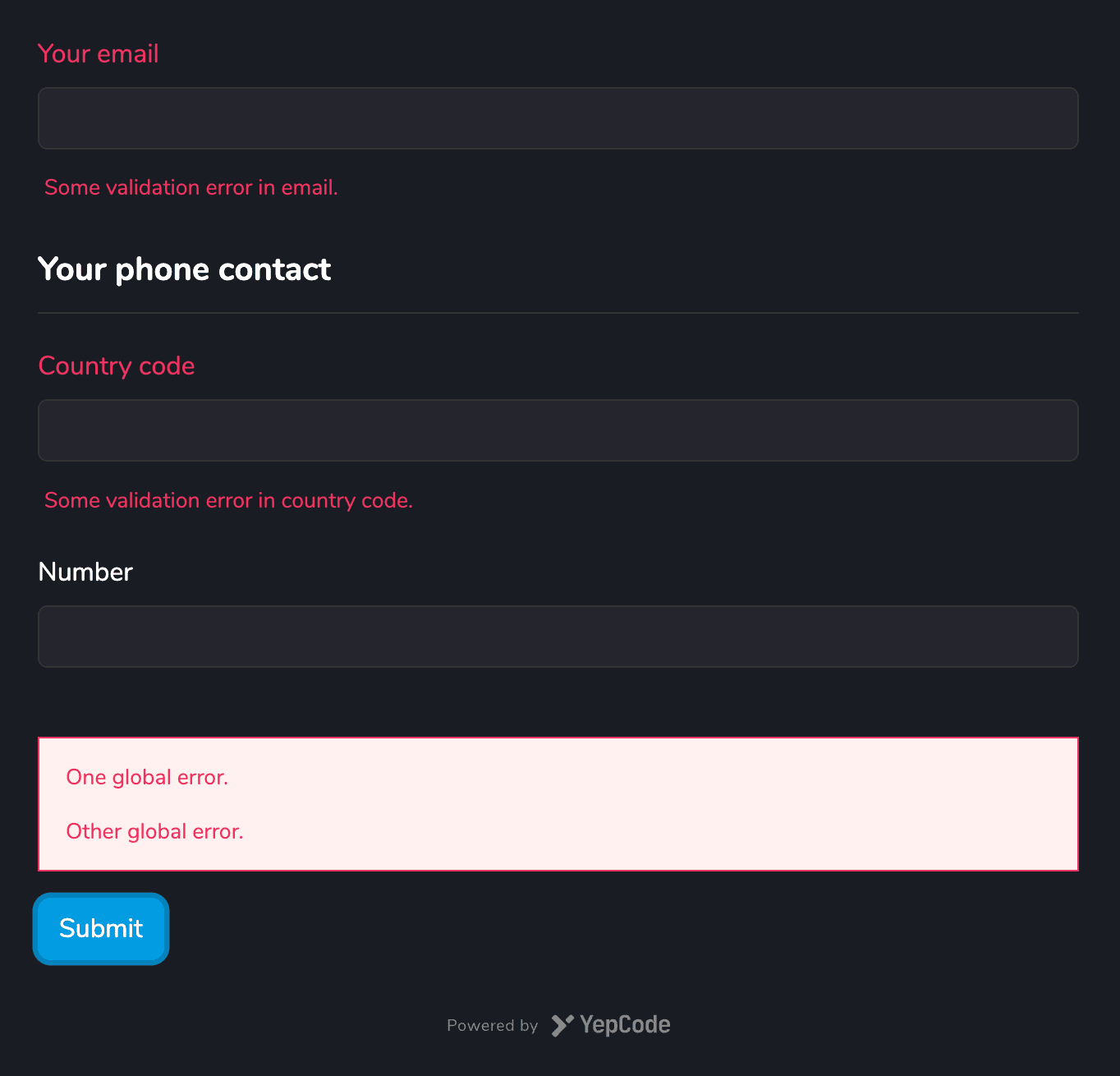
Show Inline Error Messages
Section titled “Show Inline Error Messages”Include validation errors related to the global form or specific fields. These errors are attached to the default ones that our validator already includes.
For example, if you have this form schema specification:
{ "type": "object", "title": "", "properties": { "email": { "type": "string", "title": "Your email" }, "phone": { "type": "object", "title": "Your phone contact", "properties": { "countryCode": { "title": "Country code", "type": "string" }, "number": { "title": "Number", "type": "string" } } } }}And in your process execution return an error response that includes a formErrors object:
return { status: 400, body: { formErrors: { fields: { email: "Some validation error in email.", phone: { countryCode: "Some validation error in country code.", }, }, global: ["One global error.", "Other global error."], }, },};It will be shown in the form as a validation error:
Redirect to Any URL
Section titled “Redirect to Any URL”If your process execution returns a JSON containing a redirect object with url and optionally timeout, the user will be redirected to that page after form submission:
return { redirect: { url: "https://google.com", timeout: 2000, },};Run any JavaScript Callback Function
Section titled “Run any JavaScript Callback Function”If your process execution returns a JSON containing a jsCallback attribute, that code will be executed after form submission:
return { jsCallback: ` analytics.track("User Registered", { email: "[email protected]" plan: "STARTER" }); `,};Add Initial Form Values
Section titled “Add Initial Form Values”Provide a JSON object that will be used to set initial values in the form. Particularlly useful for setting hidden fields values.
The syntax for setting these defaults in each approach would be:
<div data-yepcode-form-team="<yepcode-team-id>" data-yepcode-form-process="<yepcode-process-id>" data-yepcode-form-default-values='{ "company": "Trileuco Solutions", "oneHiddenField": "the-value" }'></div><div id="my-yepcode-form"></div><script> YepCode.initForm("#my-yepcode-form", { team: "<yepcode-team-id>", process: "<yepcode-process-id>", defaultValues: { company: "Trileuco Solutions", oneHiddenField: "the-value", }, });</script>import YepCodeForm from "@yepcode/react-forms";
const MyComponent = () => { return ( <YepCodeForm team={"<yepcode-team-id>"} processId={"<yepcode-process-id>"} defaultValues={{ company: "Trileuco Solutions", oneHiddenField: "the-value", }} /> );};Configuring YepCode Sync or Async Process Execution
Section titled “Configuring YepCode Sync or Async Process Execution”By default, all process executions are synchronous. However, for long-time executions, consider starting them asynchronously. YepCode will respond instantly with a 201 HTTP code and a JSON object containing the execution ID.
To set these default values, use the following syntax for each approach:
<div data-yepcode-form-team="<yepcode-team-id>" data-yepcode-form-process="<yepcode-process-id>" data-yepcode-form-async="true"></div><div id="my-yepcode-form"></div><script> YepCode.initForm("#my-yepcode-form", { team: "<yepcode-team-id>", process: "<yepcode-process-id>", async: true, });</script>import YepCodeForm from "@yepcode/react-forms";
const MyComponent = () => { return ( <YepCodeForm team={"<yepcode-team-id>"} processId={"<yepcode-process-id>"} async={true} /> );};Adding headers to form submissions
Section titled “Adding headers to form submissions”In the same way we support headers on webhooks, we support headers on forms, specially interesting for the initiated by header.
To set these form headers, use the following syntax for each approach:
<div data-yepcode-form-headers='{"my-custom-header": "foo"}' data-yepcode-form-team="<yepcode-team-id>" data-yepcode-form-process="<yepcode-process-id>"></div><div id="my-yepcode-form"></div><script> YepCode.initForm("#my-yepcode-form", { team: "<yepcode-team-id>", process: "<yepcode-process-id>", headers: {"my-custom-header": "foo"}, });</script>import YepCodeForm from "@yepcode/react-forms";
const MyComponent = () => { return ( <YepCodeForm team={"<yepcode-team-id>"} processId={"<yepcode-process-id>"} headers={{"my-custom-header": "foo"}} /> );};Override the API host
Section titled “Override the API host”By default the form embed talks to https://cloud.yepcode.io. You can point it at a different backend (for example, a server running yepcode http when migrating from YepCode Cloud) by setting the host URL.
<div data-yepcode-form-team="<yepcode-team-id>" data-yepcode-form-process="<yepcode-process-id>" data-yepcode-form-host-url="https://your-host"></div><div id="my-yepcode-form"></div><script> YepCode.initForm("#my-yepcode-form", { team: "<yepcode-team-id>", process: "<yepcode-process-id>", hostUrl: "https://your-host", });</script>import YepCodeForm from "@yepcode/react-forms";
const MyComponent = () => { return ( <YepCodeForm team={"<yepcode-team-id>"} processId={"<yepcode-process-id>"} hostUrl={"https://your-host"} /> );};Additional Options
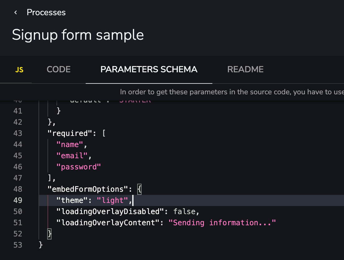
Section titled “Additional Options”YepCode Forms support additional configuration using a JSON object called options. This object can be configured in the embedded script or function, or in the JSON Schema specification:
<div data-yepcode-form-team="<yepcode-team-id>" data-yepcode-form-process="<yepcode-process-id>" data-yepcode-form-options=' { "theme": "dark (default) | light", "loadingOverlayDisabled": false, "loadingOverlayContent": "Sending information...", }'></div><div id="my-yepcode-form"></div><script> YepCode.initForm("#my-yepcode-form", { team: "<yepcode-team-id>", process: "<yepcode-process-id>", options: { theme: "dark (default) | light", loadingOverlayDisabled: false, loadingOverlayContent: "Sending information...", }, });</script>import YepCodeForm from "@yepcode/react-forms";
const MyComponent = () => { return ( <YepCodeForm team={"<yepcode-team-id>"} processId={"<yepcode-process-id>"} options={{ theme: "dark (default) | light", loadingOverlayDisabled: false, loadingOverlayContent: "Sending information...", }} /> );};Consider that this configuration will impact all instances of this embedded form. If you need to override specific settings for a particular embed, utilize the following approaches, as they take precedence over the configuration received from the platform.
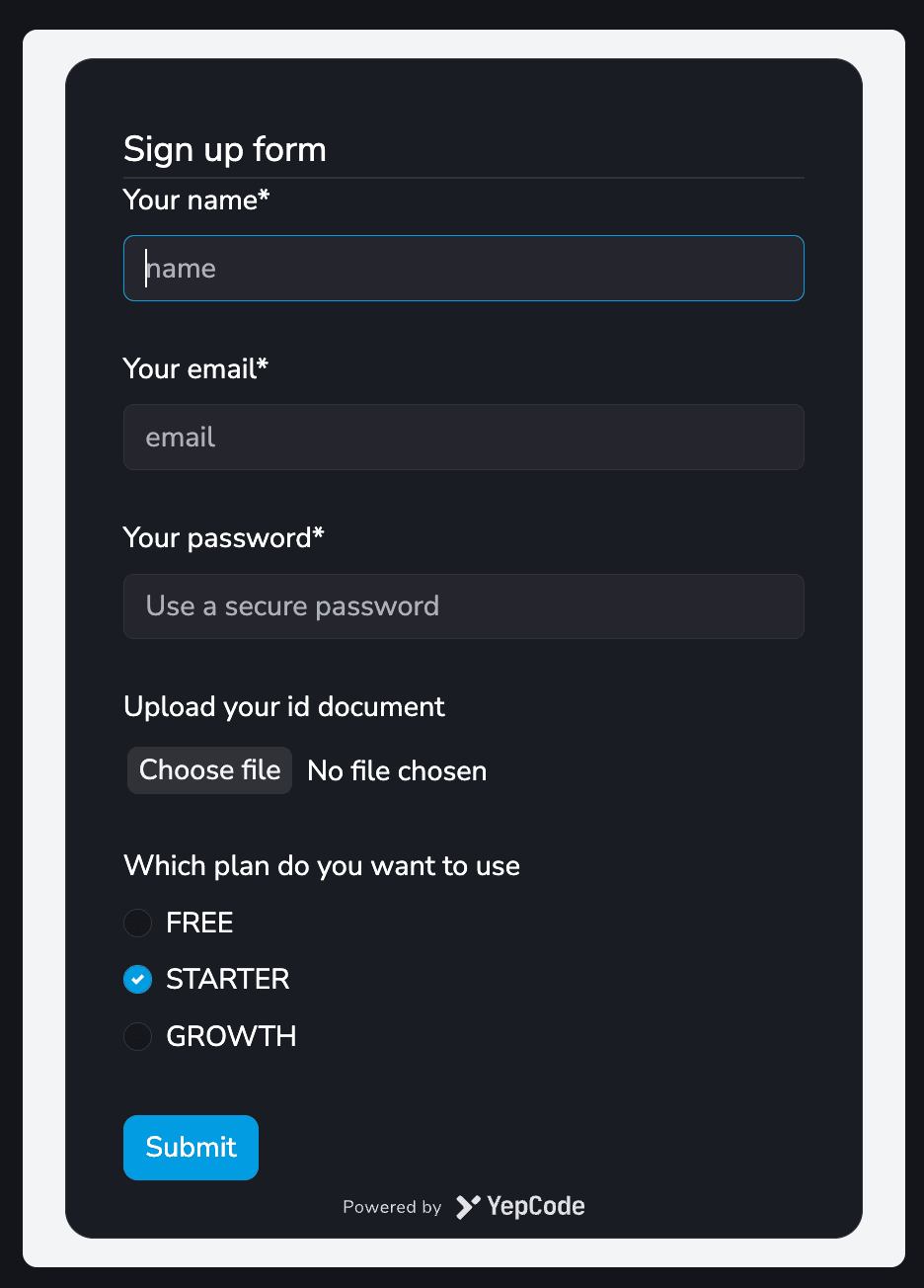
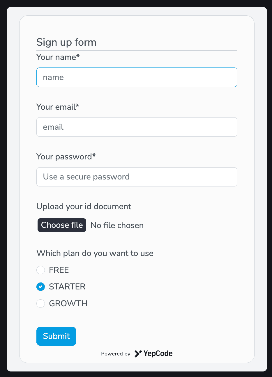
Appearance Configuration
Section titled “Appearance Configuration”YepCode Forms support several appearance configurations to align with your site’s styles.
This configuration must be provided using the options object and allows you to change various appearance details:
- Theme & styles configuration
- Disable the loading overlay
- Change the loading overlay text message
{ "theme": "dark (default) | light", "loadingOverlayDisabled": false, "loadingOverlayContent": "Sending information..."}Themes and Styles
Section titled “Themes and Styles”YepCode Forms include two out-of-the-box themes, each defined using a CSS variables file:
- Dark theme (https://yepcode.io/sdk/styles-theme-dark.css)
- Light theme (https://yepcode.io/sdk/styles-theme-dark.css)
You can create a new theme by extending any of these CSS files and setting the embedFormOptions configuration themeStylesheet, for example:
"embedFormOptions": { "themeStylesheet": "https://yepcode.io/sdk/styles-theme-hurt-eyes.css"},Another alternative is to provide the CSS rules directly into the themeStylesheet option:
"embedFormOptions": { "themeStylesheet": ":root {\n--ycf-accent-color: #05e20c;\n--ycf-accent-color-darker: #be0493;}" }For adding the same form in several pages, provide a custom class name using the form options:
"embedFormOptions": { "className": "white-background-form" }Using JSON Schema for Appearance Tunning
Section titled “Using JSON Schema for Appearance Tunning”YepCode Forms are rendered using react-jsonschema-form so all the UI schema configuration from this library, is available for use.
To provide greater flexibility to the forms and the content they render (titles, descriptions, help messages), we have enhanced and extended them to support markdown. Read more about this in YepCode parameters.”
For example, to change the submit button text, add this node in your parameters schema:
"ui": { "ui:submitButtonOptions": { "submitText": "Click me!" }}Variables Replacement in Form Definition
Section titled “Variables Replacement in Form Definition”Another powerful kind of personalization that YepCode Forms allow is variable replacement.
This allows defining variables that could differ in each form rendering. These variables are then replaced in the form definition using the mustache syntax.
Inside the additional options config, a variables node can be provided and would be used to replace tokens in all the definition schema, including titles, descriptions, default values, enums, etc.
Example of Variables for Content Customization
Section titled “Example of Variables for Content Customization”Let’s demonstrate how it works with an example. Suppose you want to implement an upgrade process, and depending on the new plan, you want to display the benefits.
Having these form schema:
{ "title": "Upgrade to {{newPlan}} plan", "description": "{{#benefits}}* {{.}}\n{{/benefits}}", "type": "object", "properties": { "email": { "title": "Your email", "type": "string", "format": "email" } }, "required": ["email"]}You could embed it with this approach and different plan configurations:
<div data-yepcode-form-team="<yepcode-team-id>" data-yepcode-form-process="<yepcode-process-id>" data-yepcode-form-options='{ "variables": { "newPlan": "STARTER", "benefits": [ "Includes 15M Yeps / month", "Max 10 concurrent executions", "Up to 10 team members" ] } }'></div><div id="my-yepcode-form"></div><script> YepCode.initForm("#my-yepcode-form", { team: "<yepcode-team-id>", process: "<yepcode-process-id>", options: { variables: { newPlan: "STARTER", benefits: [ "Includes 15M Yeps / month", "Max 10 concurrent executions", "Up to 10 team members" ], }, }, });</script>import YepCodeForm from "@yepcode/react-forms";
const MyComponent = () => { return ( <YepCodeForm team={"<yepcode-team-id>"} processId={"<yepcode-process-id>"} options={{ variables: { newPlan: "STARTER", benefits: [ "Includes 15M Yeps / month", "Max 10 concurrent executions", "Up to 10 team members" ], }, }} /> );};You can experience diverse form renderings. Visit the samples page to see them in action.
$ref variables replacement
Section titled “$ref variables replacement”One more feature that opens up a world of posibilities is the $ref variables. With these replacement you can adapt your form schema in each embed situation, with a full replacement of some node of this schema.
Suppose you have an enumeration and you need to use different options in each form embed usage. That’s possible with variables:
Having this form schema:
{ "title": "Upgrade plan", "type": "object", "properties": { "newPlan": { "title": "Your new plan", "type": "string", "enum": { "$ref": "#/variables/availablePlans" } } }, "required": ["newPlan"]}You could embed it with this approach and different available plan configurations:
<div data-yepcode-form-team="<yepcode-team-id>" data-yepcode-form-process="<yepcode-process-id>" data-yepcode-form-options='{ "variables": { "availablePlans": ["STARTER", "GROWTH"], } }'></div><div id="my-yepcode-form"></div><script> YepCode.initForm("#my-yepcode-form", { team: "<yepcode-team-id>", process: "<yepcode-process-id>", options: { variables: { availablePlans: ["STARTER", "GROWTH"], }, }, });</script>import YepCodeForm from "@yepcode/react-forms";
const MyComponent = () => { return ( <YepCodeForm team={"<yepcode-team-id>"} processId={"<yepcode-process-id>"} options={{ variables: { availablePlans: ["STARTER", "GROWTH"], }, }} /> );};Internationalization
Section titled “Internationalization”YepCode Forms allow internationalization of any visible text and default error messages.
The replacements follow a mustache syntax, and you need to use a i18nVariables inside the additional options config, with one index for each supported locale:
{ "title": "{{title}}", "type": "object", "properties": { "name": { "title": "{{nameLabel}}", "type": "string" }, "email": { "title": "{{emailLabel}}", "type": "string", "format": "email", "ui": { "ui:placeholder": "{{emailPlaceholder}}" } } }, "required": ["name", "email"], "embedFormOptions": { "loadingOverlayContent": "{{overlayMessage}}", "i18nVariables": { "en": { "title": "Signup form", "nameLabel": "Your name", "emailLabel": "Your email", "emailPlaceholder": "You have to use a business email", "overlayMessage": "Creating new user..." }, "es": { "title": "Formulario de registro", "nameLabel": "Tu nombre", "emailLabel": "Tu email", "emailPlaceholder": "Debes usar un email corporativo", "overlayMessage": "Creando nuevo usuario..." } } }}In your form renderization, set up a locale param inside the options object.
You can also use a fallbackLocale param to be used if any entry doesn’t exist on the selected locale or during errors renderization if the locale is not in the previous list.
Locale sample configuration using data attributes:
<div data-yepcode-form-team="<yepcode-team-id>" data-yepcode-form-process="<yepcode-process-id>" data-yepcode-form-options=' { "locale": "gl", "fallbackLocale": "es" }'></div><div id="my-yepcode-form"></div><script> YepCode.initForm("#my-yepcode-form", { team: "<yepcode-team-id>", process: "<yepcode-process-id>", options: { locale: "gl", fallbackLocale: "es", }, });</script>import YepCodeForm from "@yepcode/react-forms";
const MyComponent = () => { return ( <YepCodeForm team={"<yepcode-team-id>"} processId={"<yepcode-process-id>"} options={{ locale: "gl", fallbackLocale: "es", }} /> );};So during form renderization, the i18n variables would be replaced, and you could get different forms renderizations. Visit samples page to see more forms in action.
Customizing behaviour with functions
Section titled “Customizing behaviour with functions”One advanced personalization feature is the posibility to extend inputs using JavaScript functions.
One interesting use case could allow using some dynamic behaviour when a user is filling information. For example, using a pattern and changing the provided values, or changing one attribute value depending on another attribute value.
This configuration must be provided inside the embedFormOptions node, and there are two types of customization:
Global onChange Handler
Section titled “Global onChange Handler”Using this configuration, you may provide a JavaScript function implementation that could receive two parameters:
formData: current form data valuessetFormData: function to change form data values
For example, suppose you want to fill a phone country prefix depending on the country selected:
"embedFormOptions": { "onChange": "phonePrefixByCountryCode = {'ES': '+34', 'US': +1, 'UK': '+44'}; formData['phonePrefix'] = phonePrefixByCountryCode[formData['countryCode']]; setFormData(formData);", }Field Transformer Function
Section titled “Field Transformer Function”Using this configuration, you may provide a JavaScript function implementation that receives a value parameter.
This function should return a new value to be set to that attribute form data.
Here you have a sample that would replace a provided phone number to fit with the desired format:
"embedFormOptions": { "fields": { "phone": { "transformFn": "if(!value) return null; return value.replace(/^\\(?(\\d{2})\\)?[ ]?(\\d{5})-?(\\d{4})$/, '($1) $2-$3');" } } }Modal Window
Section titled “Modal Window”YepCode Forms can be shown in a modal window after the user clicks on some element. To achieve this, you only need to add all the form configuration to that element, and also include the data attribute data-yepcode-form-modal. Here you have one example:
<button data-yepcode-form-modal data-yepcode-form-team="<yepcode-team-id>" data-yepcode-form-process="<yepcode-process-id>">Open the form</button>